About

We were delighted to partner with the Goldstein family, London’s oldest salmon curers, on a full rebrand that celebrates their remarkable heritage while introducing a bold, contemporary look.

We developed a new logo and packaging range that captures the essence of the curing process through sea, salt, and smoke, expressed in a clean, graphic visual style. The new identity reflects Goldstein’s long-standing reputation for quality while giving the brand a confident, modern presence both on shelves and online. The rebrand elevates the customer experience and reinforces Goldstein’s position as a trusted name in premium smoked salmon for generations to come.

Works Included: Logo Design, Packaging Design, Social Media Templates, Stationery Design
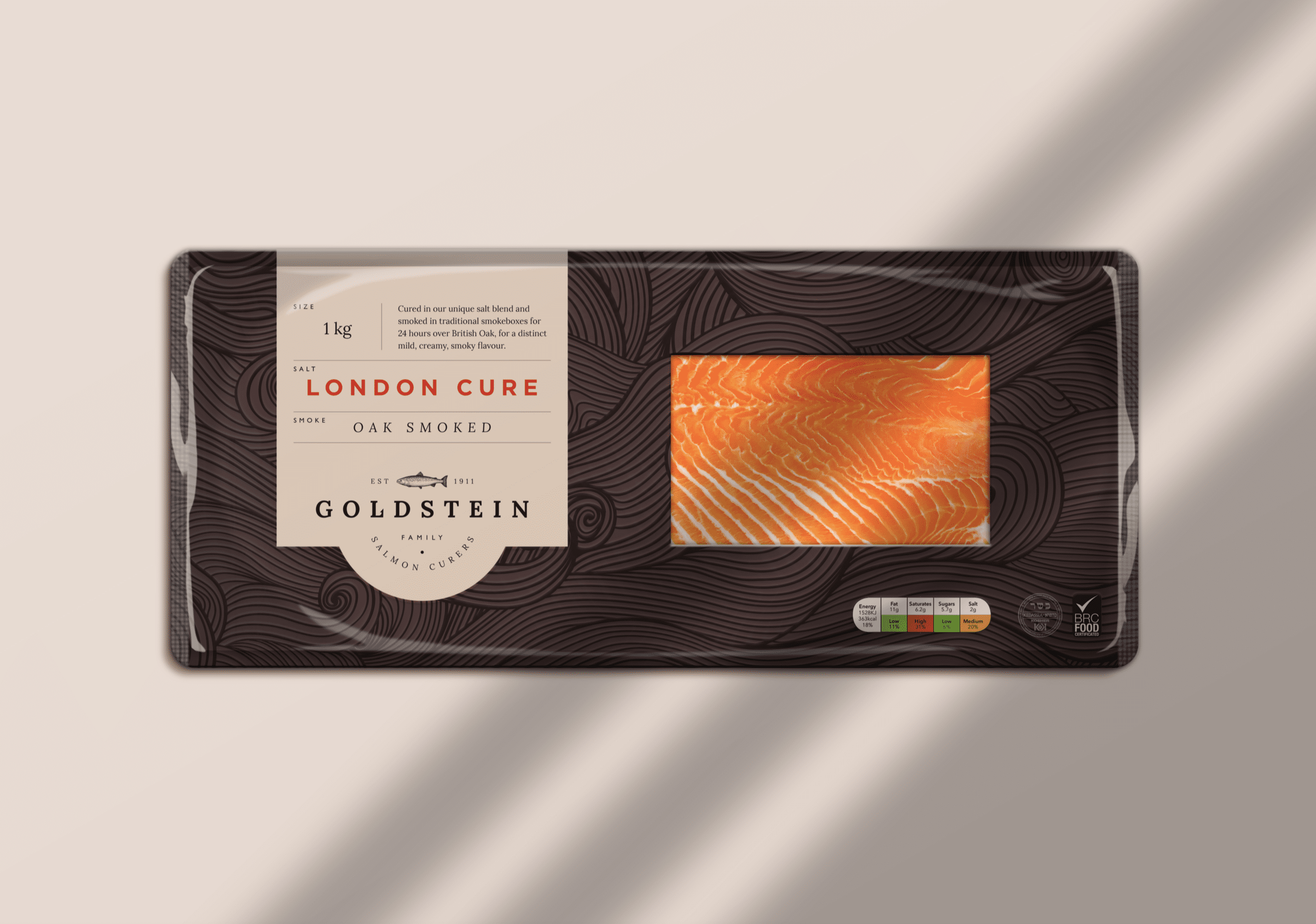
Packaging of smoked salmon with a bright orange and white marbled piece of smoked salmon visible through a clear window. The packaging has a black swirly pattern with a beige label containing product information, brand name 'Goldstein' and a small fish logo. The label indicates the salmon is 'London Cure' and smoked oak, weighing 1 kg.
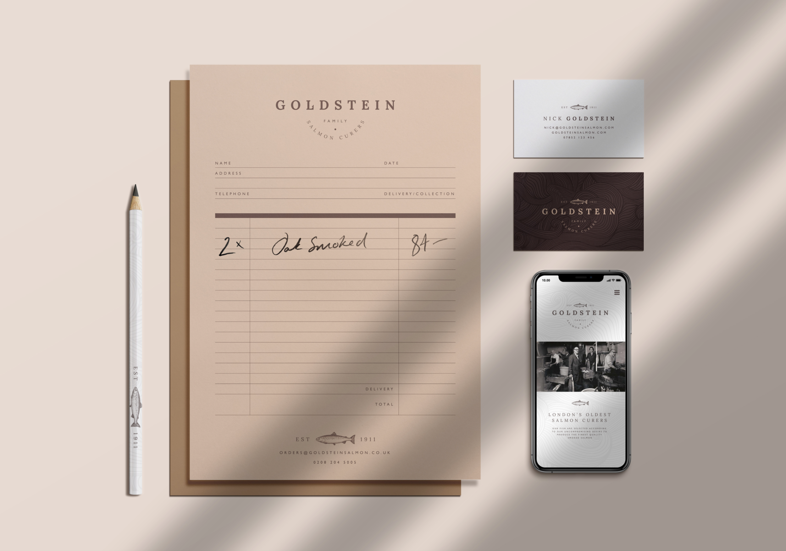
A salmon fishing business branding display with business cards, a sheet for orders, and a pen, all featuring the name 'Goldstein' and a salmon fish logo, along with an iPhone showing a photo of a salmon fishing scene.
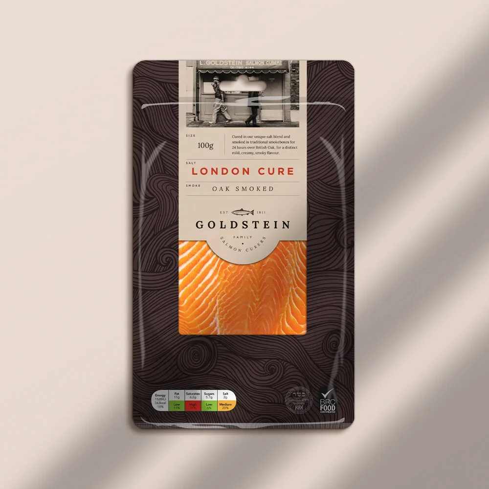
Package of Goldstein London Cure oak smoked salmon with a label showing product details and a piece of salmon visible through the transparent section.
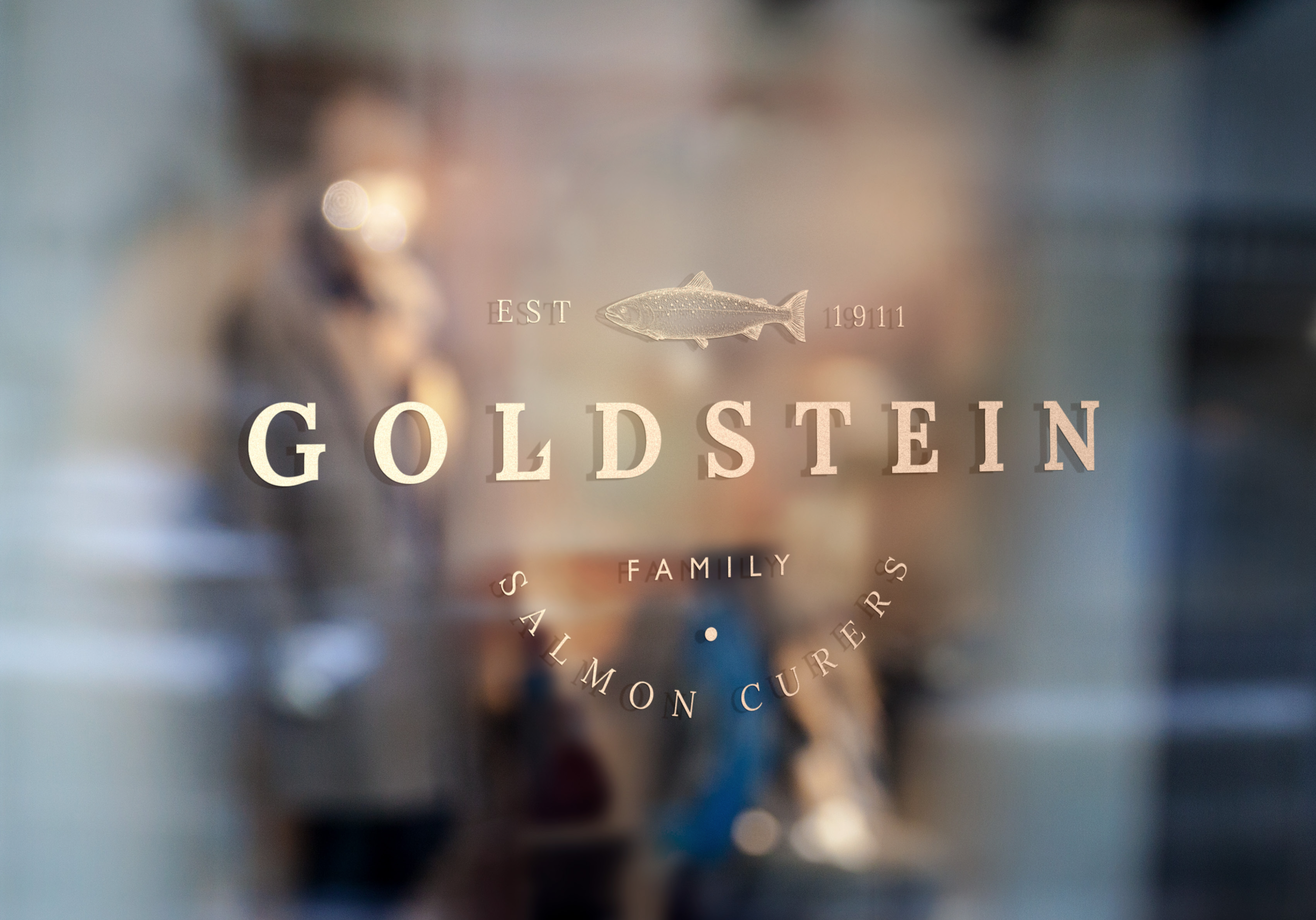
Close-up of an engraved metal surface with the word "GOLDSTEIN" prominently displayed, along with the text "EST 1911" and a fish illustration, with background details blurred.