About
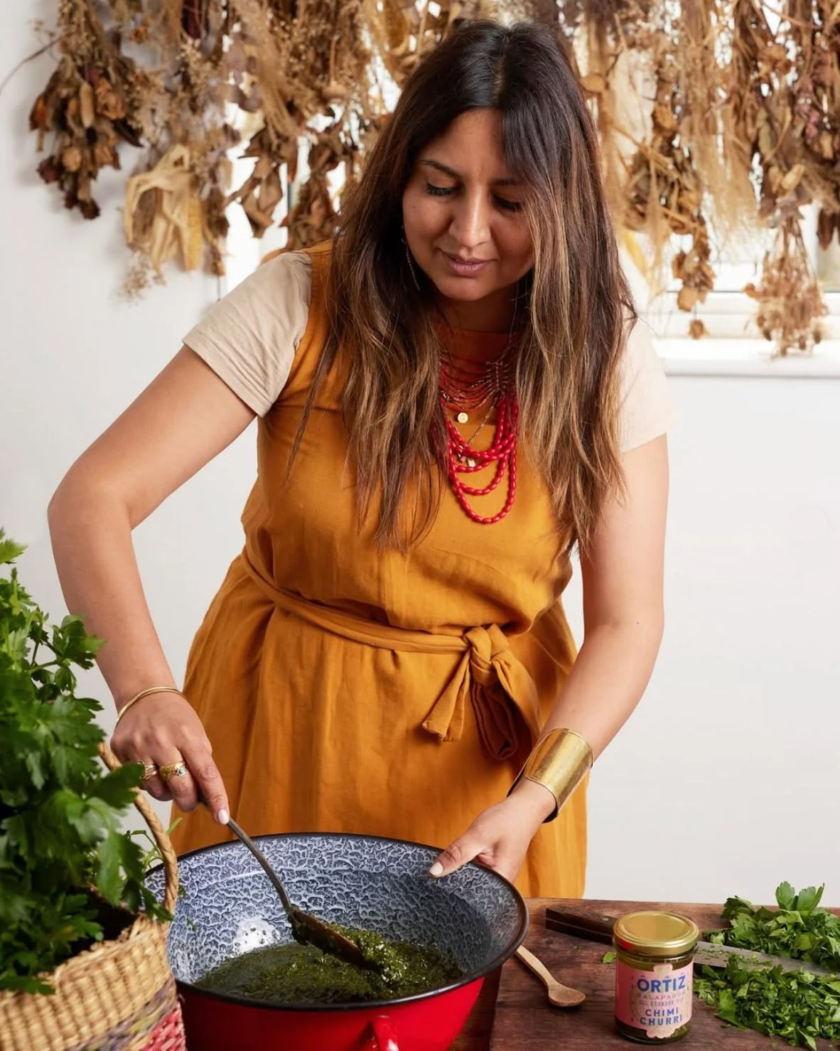
We were thrilled to work with Chef Ana Ortiz on the creation of her personal brand and the launch of her first product range. Drawing inspiration from her Galápagos upbringing, Ana’s recipes bring together bold flavours and a love for cooking over fire.
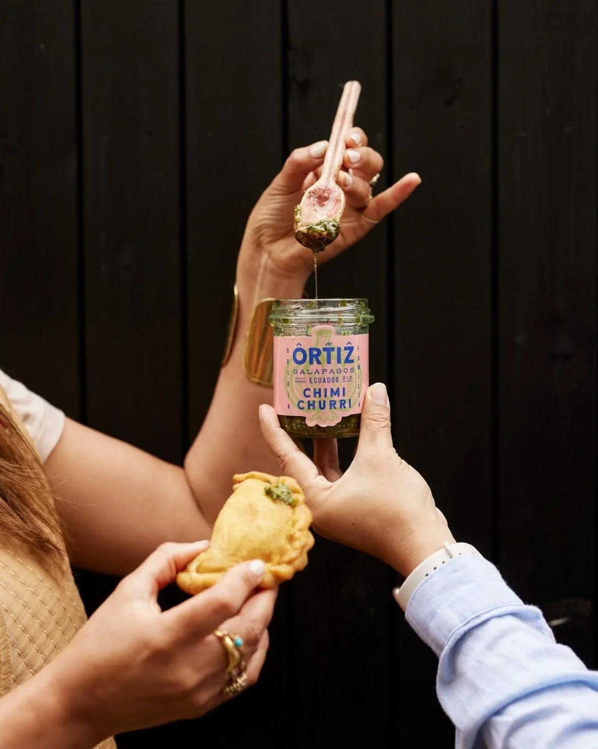
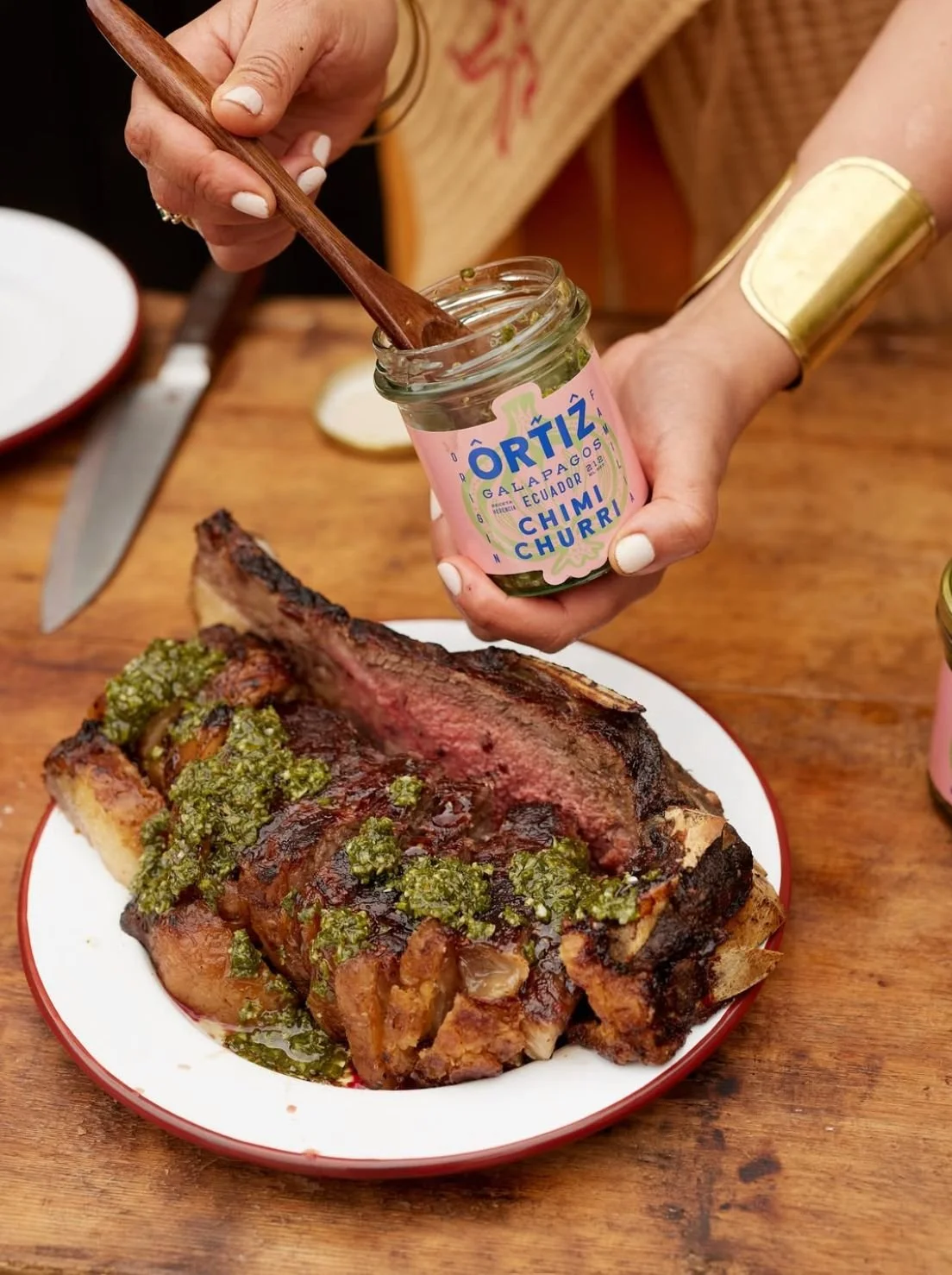
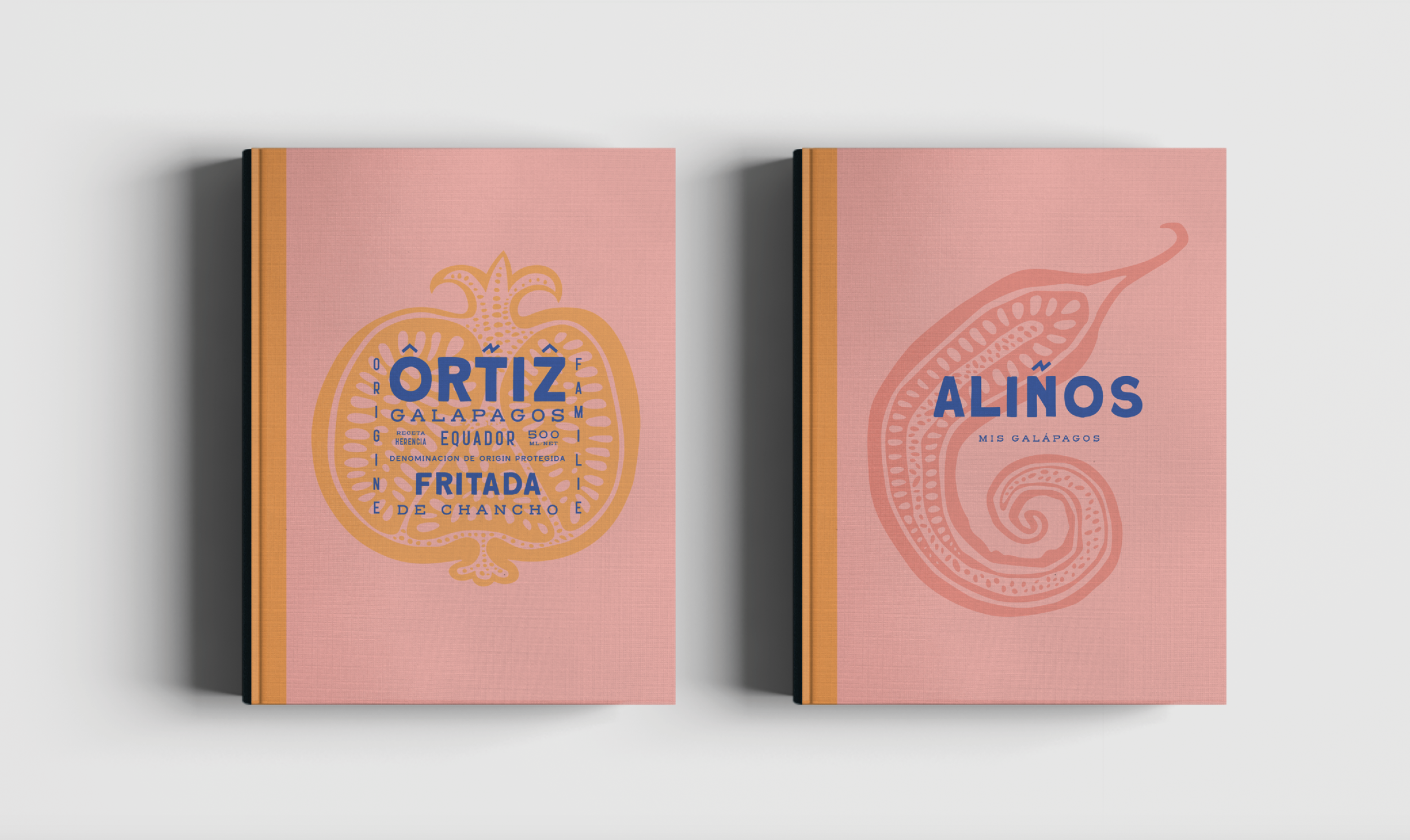
Our challenge was to translate her vibrant personality and culinary style into a cohesive brand identity. We developed the branding and packaging design for her debut products, chimichurri and aliños, ensuring every detail reflected her passion for fresh, authentic flavour.
The designs capture the colour, energy, and warmth of Ana’s cooking while evoking the spirit of fire and the natural vibrancy of the Galápagos. The result is a brand that feels personal, expressive, and instantly recognisable, perfectly positioned to share Ana’s culinary heritage with a wider audience.
Works Included: Logo Design, Packaging Design. [ ◉¯] by Ed Schofield, Alex Doe & Matt Austin.